

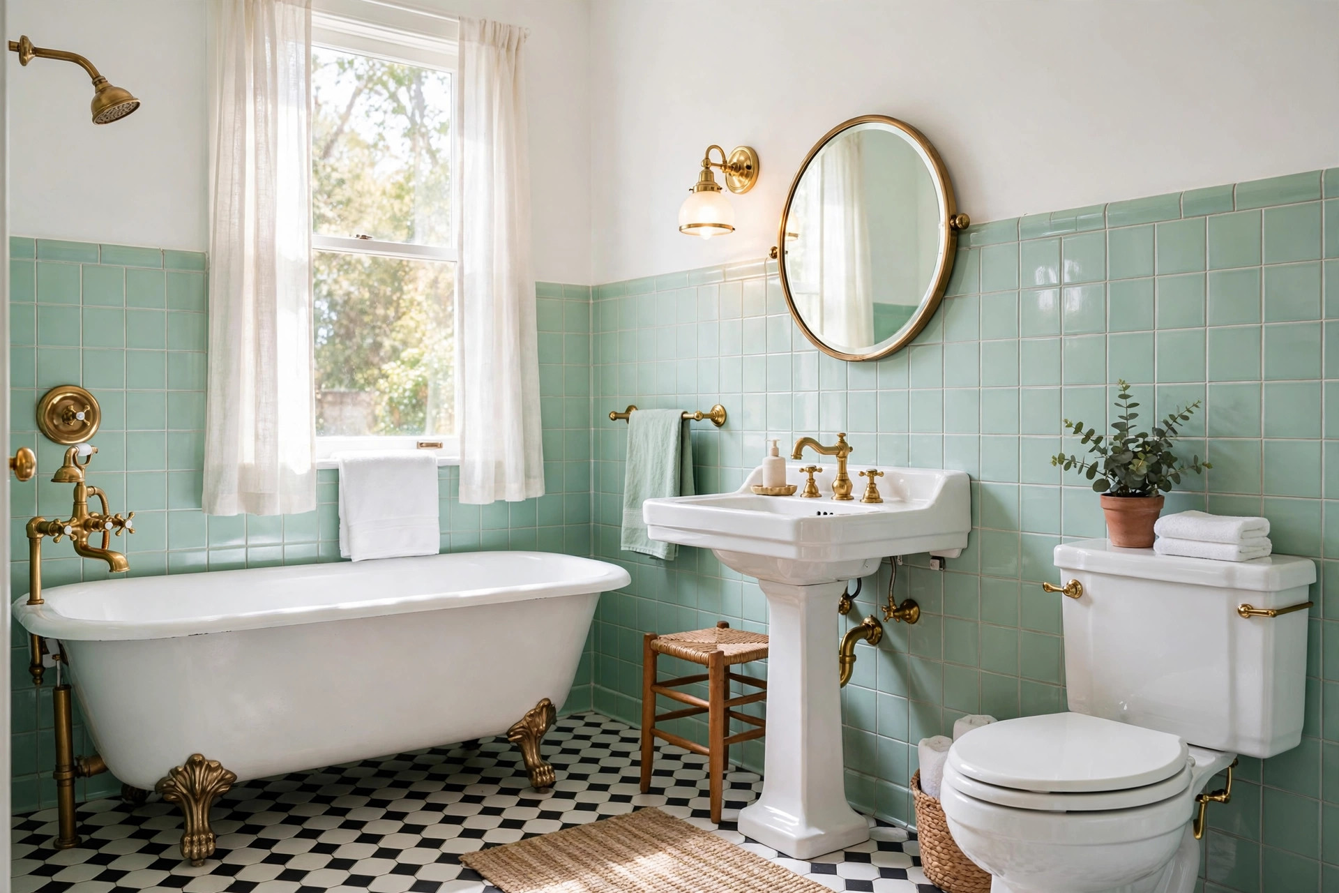
If you have ever stood in front of a wall of mint green tile and wondered what color goes with mint green bathroom tile, you are in very good company. Mint green is one of the most charming colours in vintage bathrooms — fresh without being cold, retro without feeling dated — but it can be surprisingly tricky to dress. Pair it with the wrong shade and the whole room can tip into toothpaste territory; pair it right and it looks like it stepped out of a 1950s design magazine. The good news is that mint is a generous team player. Because it sits between green and blue on the colour wheel, it works with warm neutrals, deep contrasts, soft pastels and gleaming metals alike. Here are nine pairings that never fail, with paint colours, materials and styling notes for each.
1. Crisp White and Soft Cream: The Classic Pairings
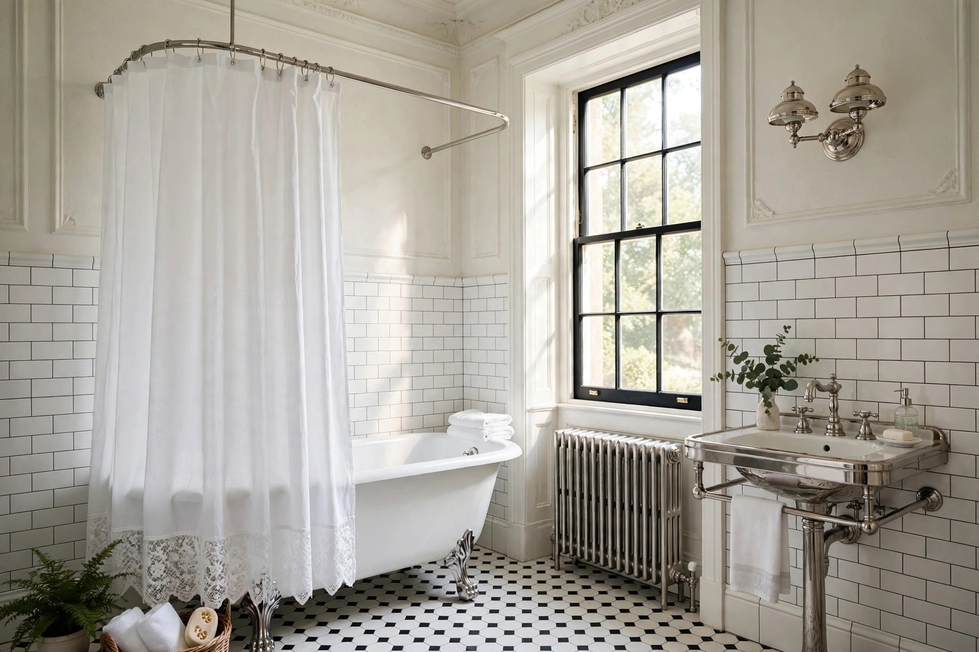
White is the safest and, frankly, the loveliest partner for mint green tile. A bright white ceiling, white sanitaryware and white-painted woodwork let the tile be the star while keeping the room feeling clean and spacious. For walls above the tile line, try a true white such as Benjamin Moore Chantilly Lace or Farrow & Ball All White, which have almost no yellow undertone to fight the mint. If pure white feels too stark, warm it up a notch with a soft cream — think Benjamin Moore White Dove or Farrow & Ball Wimborne White. Cream softens the contrast and suits bathrooms with warm timber floors or a vintage clawfoot tub. Either way, keep grout white or very pale grey; dark grout against mint tile can look busy and makes small bathrooms feel smaller. White towels, a white shower curtain and a white-framed mirror complete the look for under $100 if you shop the high street.
2. Warm Metals: Brass, Gold and Copper
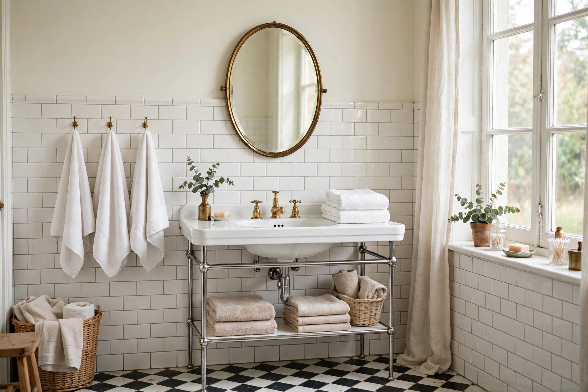
Nothing flatters mint green quite like warm metal. Unlacquered brass taps, a brass mirror frame or a set of gold cabinet pulls add the warmth that cool mint needs, and the combination reads instantly vintage — it is the palette of 1930s and 1940s bathrooms. A brushed brass tap set typically costs $150–$400, while a simple brass-framed mirror runs $60–$180. Copper works beautifully too, especially in smaller doses: a copper soap dish, a copper towel ring or copper light fixtures bring a soft rosy glow that stops mint from feeling chilly. If your budget is tight, swap just the hardware first — new drawer pulls and a towel bar in aged brass can transform the room for less than $50. Avoid chrome overload here; a little chrome is fine, but a whole room of cool silver against cool mint can feel clinical rather than charming.
3. Deep Contrasts: Navy, Charcoal and Matte Black
When you want drama, go dark. Navy blue is mint’s sophisticated older cousin: paint the wall above the tile in a deep navy such as Farrow & Ball Hague Blue or Benjamin Moore Hale Navy and the mint tile suddenly looks jewel-like. Charcoal grey works the same way and is a better choice if your bathroom gets little natural light, since it reads softer than true black. Matte black is the boldest option of all — black-framed mirrors, black tapware and a black-framed shower screen give a mint-tiled bathroom a crisp, graphic edge that feels thoroughly modern while honouring the vintage tile. Keep dark colours to one or two surfaces, though: a navy wall plus black fixtures is plenty, and the remaining surfaces should stay pale so the room does not close in. In a windowless bathroom, limit dark paint to a single feature wall.
4. Soft Colour: Blush Pink, Peach and Butter Yellow
Mint green loves a gentle pastel partner, and this is where vintage bathrooms truly shine. Blush pink is the classic 1950s pairing — pink towels, a pink-painted vanity or a blush shower curtain against mint tile feels like a powder room from a Palm Springs motel, in the best possible way. Peach is warmer and slightly more grown-up; it works particularly well with the warmer, more yellow-based mint tiles found in 1940s homes. Butter yellow, meanwhile, adds sunshine to north-facing bathrooms that never see direct sun — try it on a painted vanity or in the form of a yellow-framed print above the towel rail. The trick with pastels is proportion: let mint dominate, use one pastel as an accent, and keep everything else white. Two competing pastels plus mint quickly becomes a sweet shop. A good rule of thumb is 60 per cent mint and white, 30 per cent your pastel, and 10 per cent metal or wood.
5. Natural Wood, Plants and Stone
Finally, do not overlook natural materials. Warm wood — a walnut vanity, teak bath mat or oak-framed mirror — grounds mint tile and stops it from floating away into pastel-land. Medium and dark woods work best; pale pine can clash with mint’s cool undertone. A marble or pale stone floor is another natural partner: white Carrara marble with soft grey veining echoes the tile’s coolness while adding luxury, and large-format stone-look porcelain tiles cost $4–$10 per square foot, far less than real marble. Then add life: a trailing pothos on a shelf, a small fern on the windowsill or a bunch of eucalyptus in a jar brings in a deeper green that makes the mint look intentional rather than accidental. Plants also thrive in bathroom humidity, so this is one styling trick that genuinely earns its keep.
How to Pick the Right Pairing for Your Bathroom
Before you commit to paint or fixtures, test your pairing in the real room. Hold paint swatches against the tile in both daylight and evening light, because mint shifts noticeably under warm bulbs — a pairing that looks perfect at noon can turn muddy at night. Start with the biggest decision first: your wall colour above the tile, then your metal finish, then your textiles. And remember that you do not need all nine pairings at once. The most beautiful mint bathrooms pick two or three — say, crisp white, warm brass and a touch of blush — and repeat them consistently. Mint green tile has already survived seventy years of trends; give it the right partners and it will happily carry your bathroom for seventy more.

GIPHY App Key not set. Please check settings