

Choosing the best paint colors for a vintage bathroom is about more than picking something pretty — the right shade anchors the whole era you are trying to evoke. A soft mint green whispers 1955; a deep bottle green says Victorian with confidence; a warm cream keeps a 1920s black-and-white scheme from feeling stark. Paint is also the cheapest transformation in the room, which makes getting the shade right a high-value decision.
Below are nine designer-approved shades organised by era, with notes on where each one works best and which finishes to choose. I have kept the descriptions generic rather than naming specific paint brands, since formulations change — take these descriptions to your paint counter and match from a swatch.
Victorian Era: Deep Greens and Rich Tones
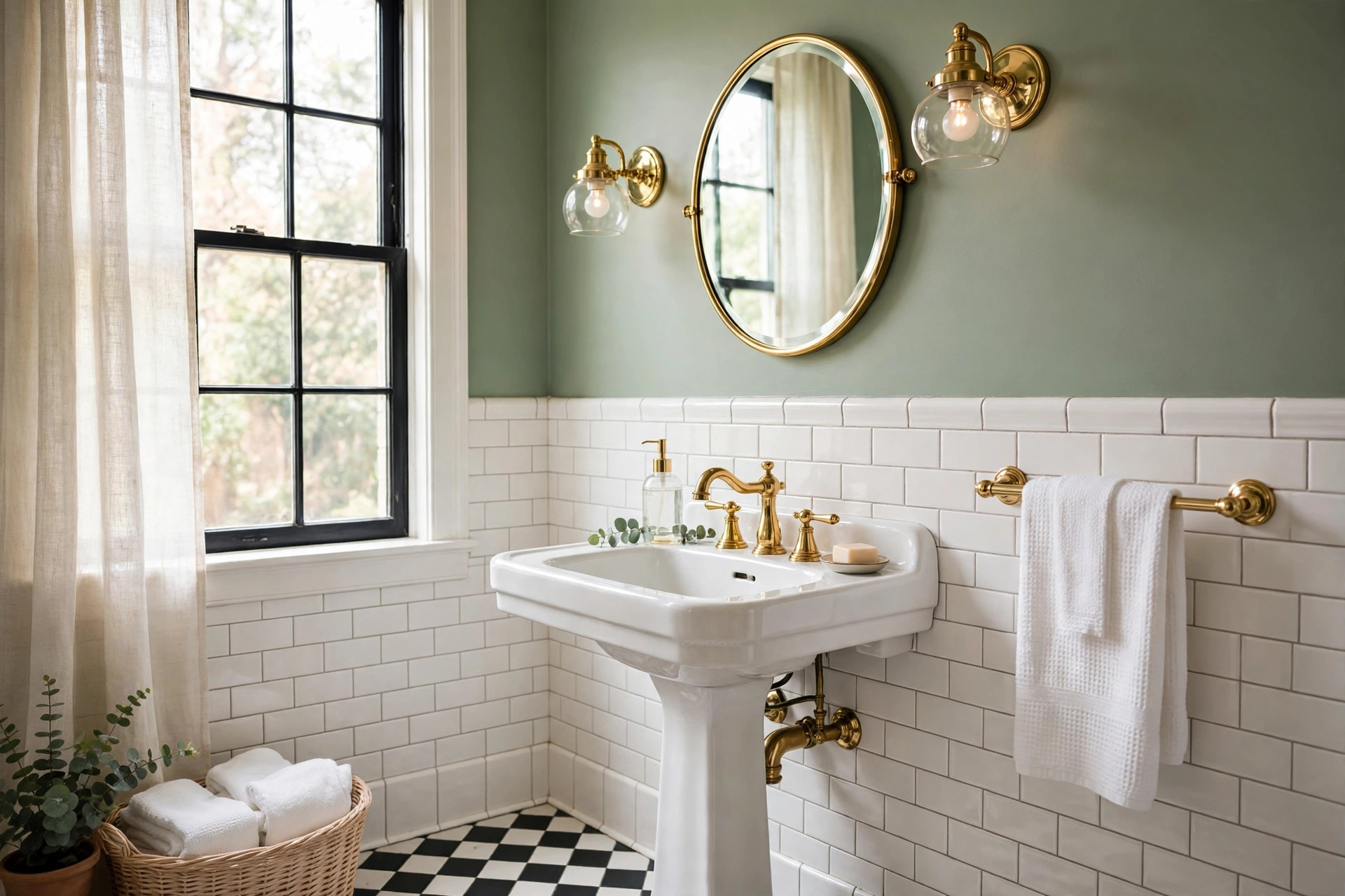
Deep bottle green. The quintessential Victorian bathroom colour: saturated, moody, and magnificent against white porcelain and polished brass. Use it on walls above a tile wainscot, or go bold and paint the whole room, keeping the ceiling bright white. In small bathrooms, confine it to one accent wall or the wainscot itself to avoid a cave effect.
Burgundy and oxblood. Less common today but thoroughly period-correct for late-Victorian interiors, especially paired with dark wood and brass. A little goes a long way — consider it for a single wall or for painted woodwork rather than all four walls.
1920s–1930s: Black, White, and Soft Neutrals
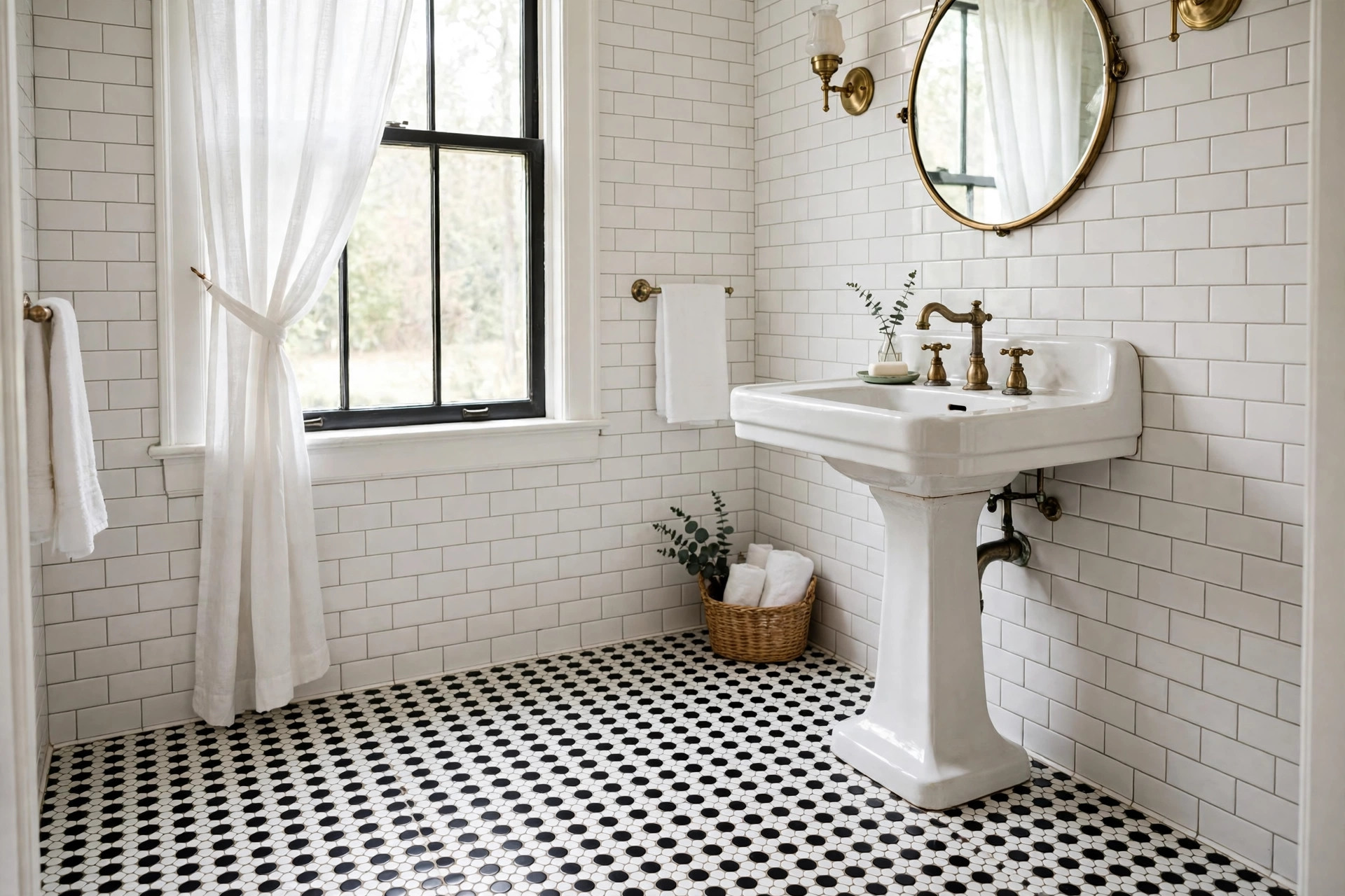
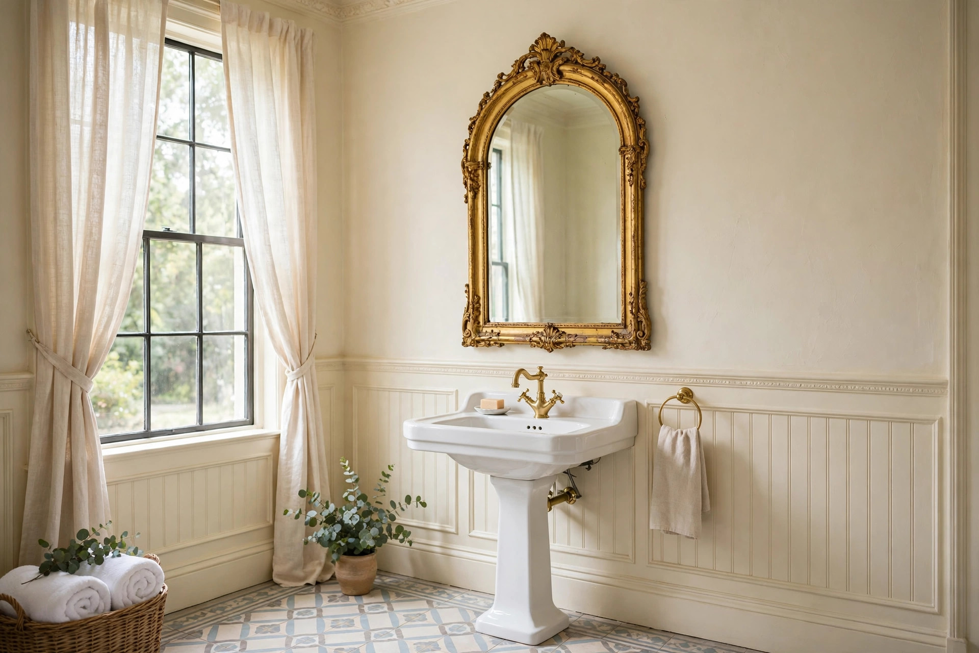
Warm cream. The 1920s bathroom was typically black-and-white tile with plaster walls above, and a warm cream on those walls softens the contrast beautifully. Avoid stark white paint here — it can make the room feel clinical. A cream with a hint of yellow keeps the period warmth.
Pale grey. A soft, warm grey works wonderfully in Art Deco bathrooms, especially with black trim and chrome fixtures. Keep it light: in a windowless bathroom, mid-tone greys can turn gloomy under artificial light.
Gloss black (for trim and doors). Authentic 1920s–30s bathrooms often featured black-painted woodwork. A high-gloss black on the door, window trim, or a wainscot cap rail adds drama and period credibility for the price of a quart of paint.
1950s: Pastel Perfection
Mint green. Perhaps the single most recognisable 1950s bathroom colour. Mint walls with white fixtures and chrome are the atomic-age look in its purest form. If your room has original pastel tile, match the paint to the tile’s undertone — mint tile with blue undertones needs a different paint than mint with yellow undertones.
Powder pink. The 1950s pink bathroom is iconic, and a soft powder pink on the walls (or a pink ceiling, if you are feeling brave) completes it. Keep the pink muted and slightly greyed rather than bubblegum — the originals were dustier than people remember.
Butter yellow. A cheerful, sunny 1950s shade that flatters every skin tone in the mirror — no small thing in a bathroom. Works beautifully with white tile and warm wood tones.
1960s–1970s: Warmth and Earth
Avocado and olive green. The much-maligned 1970s palette is having a genuine revival, and an olive green bathroom with warm wood and brass can look surprisingly sophisticated. Use it with plenty of white to keep it fresh rather than dated.
Warm terracotta. A soft, dusty terracotta suits Mediterranean and Spanish-revival vintage bathrooms wonderfully. Pair with cream tile and dark wood for a look that feels collected rather than decorated.
Choosing the Right Finish
Bathroom paint needs to handle humidity, so finish matters as much as colour. For walls, a satin or eggshell finish resists moisture while still looking soft — flat paint marks too easily and can harbour mildew. For trim, doors, and wainscoting, semi-gloss is the period-correct and practical choice; it wipes clean and the sheen echoes the gloss of vintage tile.
Always use a bathroom-rated paint or add a mildew-resistant additive, and never skip the primer on bare plaster or previously glossy surfaces. Two coats minimum — vintage colours are often deeply pigmented and need full coverage to read correctly.
Testing Colours in Your Space
Paint a large test patch — at least 60 x 60 cm — on the actual bathroom wall, and live with it for three or four days. Bathrooms have unusual light: small windows, overhead fixtures, and lots of reflective tile and porcelain that bounce colour around. A shade that looks perfect on a swatch card can shift dramatically once surrounded by white subway tile. Check it in daylight and at night under your actual bulbs, because warm and cool lighting can move a colour a full step on the spectrum.
Small Bathroom Colour Rules
Dark colours can work in small vintage bathrooms — a deep green powder room is a classic for a reason — but they demand good lighting and a light ceiling. If your bathroom has no window, lean lighter on the walls and put the drama in the trim, the mirror frame, or a single accent wall. And remember: the ceiling is the fifth wall. A soft white or very pale tint of your wall colour keeps a small room feeling tall.
Closing Thoughts
The best paint colors for a vintage bathroom are the ones that commit to an era. Pick your decade, choose a shade with genuine period roots, test it in your actual light, and finish it properly for the humidity. For the cost of a few litres of paint and a weekend’s work, you can move your bathroom fifty years in either direction — which, pound for pound, is the best value in vintage decorating.

GIPHY App Key not set. Please check settings